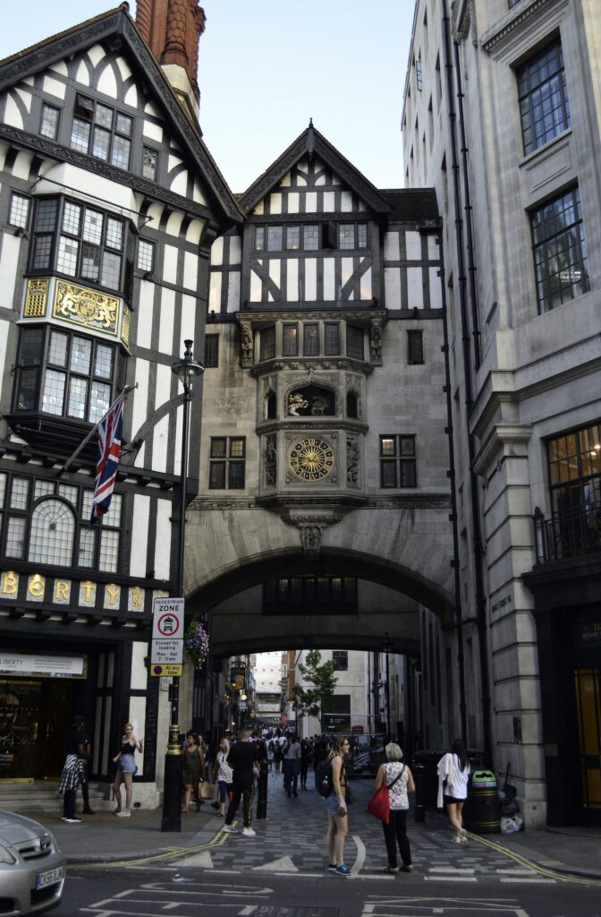
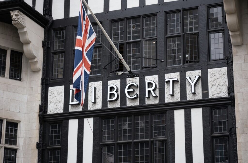
Just off Regent Street, along the polished sweep of Great Marlborough Street, Liberty London rises like a mirage from another century. In a city defined by glass façades and illuminated branding, its dark timber frontage is impossible to miss. Heavy beams, irregular windows, and deep shadow interrupt the visual rhythm of the street.
Founded in 1875 by Arthur Lasenby Liberty, the store has long stood as one of London’s most recognisable retail institutions, known for its fashion, fabrics, and homewares, as well as its unmistakable Tudor Revival building. While its façade appears centuries old, its current structure was completed in the 1920s, reflecting a revivalist architectural movement rather than medieval preservation. As London historian Jessica Storoschuk explains, the building is often misunderstood. Liberty’s store on Great Marlborough Street is very much a product of the era in which it was built, as the 1920s saw a resurgence of Tudor-style architecture across the city, making Liberty entirely of its time.
Much of the timber that shapes the interior was salvaged from Royal Navy battleships, including HMS Impregnable and HMS Hindustan. These structural beams dominate the store visually. Their dark surfaces absorb light, soften transitions between rooms, and create an atmosphere entirely distinct from the bright, reflective surfaces of contemporary department stores.
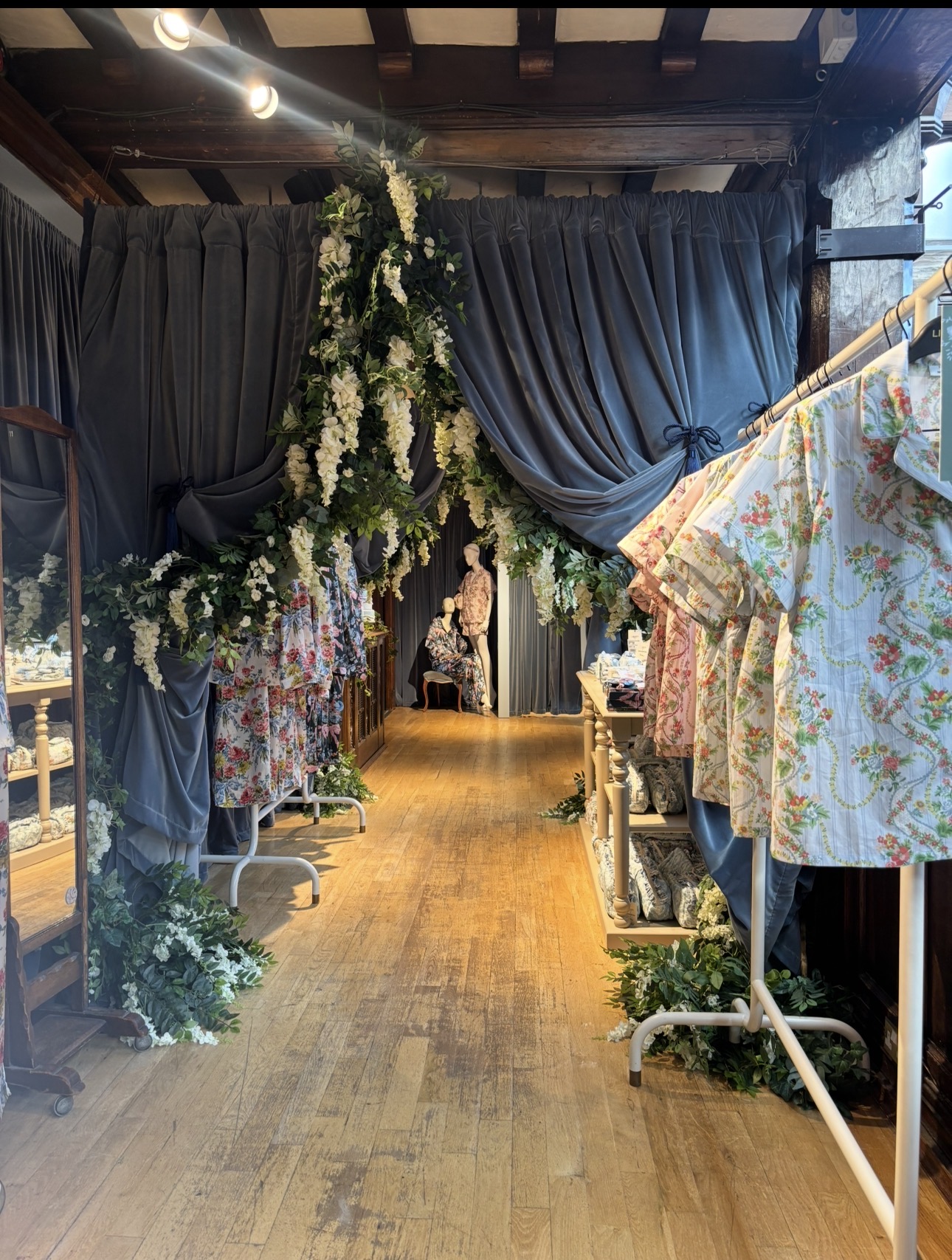
Stepping inside Liberty is certainly a much different sensory experience than the average department store shopping trip. Instead of a single open vista, you are met with a series of interconnecting rooms that reveal themselves gradually. The store does not surrender itself in one glance; it unfolds in a way that feels inviting and intimate to customers. A Liberty sales associate describes the reaction she sees daily. “Visitors often comment on how different Liberty appears compared with other department stores, especially on the first entry.”
In a retail landscape where many stores favour bright signage and immediate visual impact, Liberty takes what she calls a more tasteful approach. To understand how deliberate that structure is, I spoke to Andy Smith, a professional store organiser and retail spatial strategist who works with brands to design layouts that influence customer movement and purchasing behaviour. His role involves analysing how architecture, lighting, and merchandising shape consumer psychology. Although he does not work for Liberty, the principles he applies across major retail environments illuminate exactly why Liberty feels the way it does.
“Layout is extremely important to different retail businesses,” Andy explains. “Some retailers want a seamless, frictionless and time-efficient experience. Others intentionally design disruption. They slow customers down.”
Where modern department stores often prioritise open floor plates and uniform lighting to enable rapid visual scanning, Andy emphasises that expectation begins before a customer even crosses the threshold. “There’s your own perception of what you are entering into,” he says. “For Liberty, you’re highly likely to go in with an expectation to browse and be inspired. In other retailers, you might already have a planned mission, focused on convenience.” Liberty’s layout encourages wandering and discovery, so visitors expect to browse and be inspired. Many modern retailers, by contrast, are designed for speed and convenience, so shoppers often arrive with a specific item in mind.
Liberty’s architecture reinforces that mindset. Its cellular layout, carved staircases, and wraparound balconies invite wandering rather than efficiency. You cannot absorb the store in one sweeping glance, forcing customers to spend longer looking through the aisles. Sightlines play a crucial role in that movement. Andy describes them as a psychological reassurance. “Being able to see where the next point in your journey is matters just as much as where you are at that very moment,” he explains. “Customers need to subconsciously map their path.”
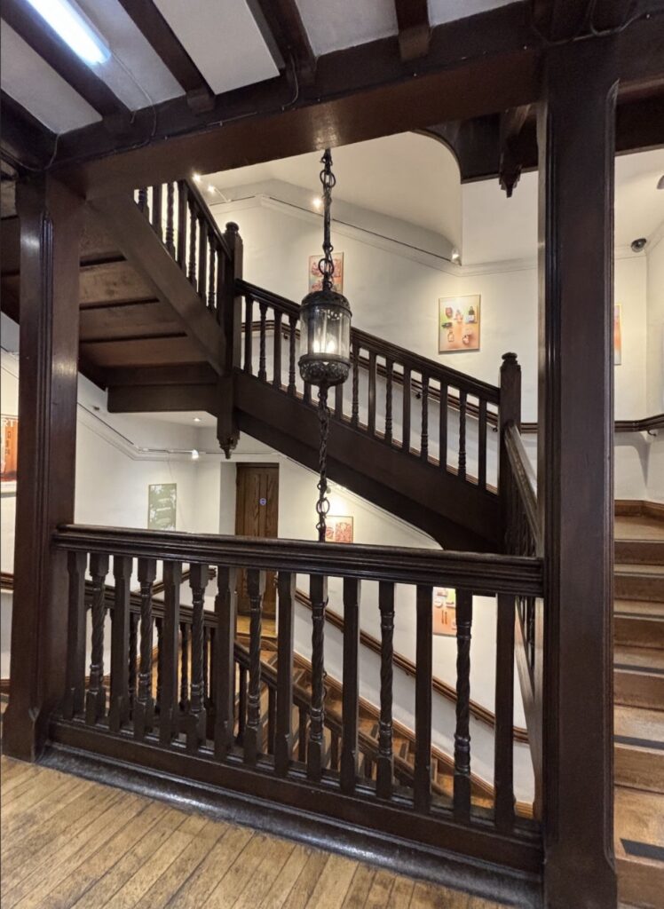
At Liberty, this mapping is subtle but constant. Balconies overlook lower floors, staircases draw the eye upward, and openings between rooms offer glimpses of colour and texture beyond. Customers are guided by the layout, but never hurried through the store.
The lighting of Liberty intensifies this effect. Throughout the store, illumination is deliberately restrained. Dark wood absorbs rather than reflects light, reducing glare and allowing colour and texture to stand forward. Andy notes that lighting is one of the most powerful psychological tools in retail. “The more you see, the more you understand,” he says. “Good lighting doesn’t just present the overall space. It highlights the areas retailers want you to focus on. Different white tones flatter different products. It’s incredibly specific.”
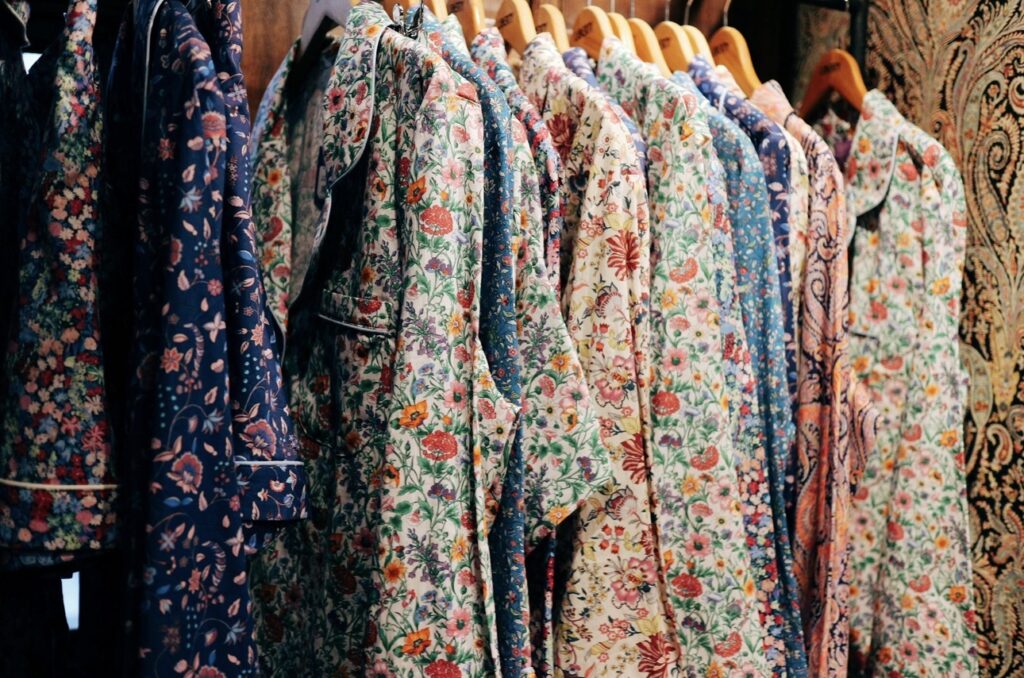
Within the department store, the warmth of the lighting flatters the grain of timber and the intricacy of print. In the fabric department, walls are densely lined with Liberty’s iconic florals, creating a continuous field of pattern and colour. Jessica Storoschuk observes that these prints are still used liberally throughout the store, reinforcing its storied and continuing legacy. The visual effect is immersive. The eye moves laterally, registering shifts in hue and motif. Rather than isolating single products, the display encourages comparison and prolonged glances.
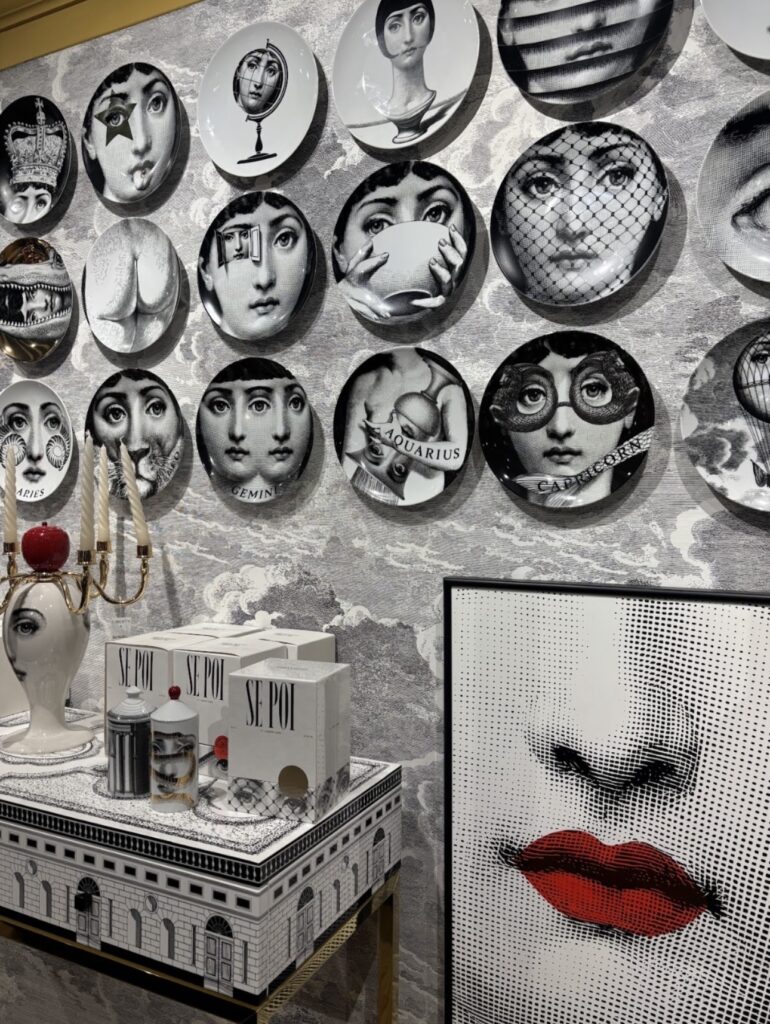
In the dining department, objects are arranged in ways that highlight their unique and intricate designs. Plates are often displayed on the walls, making them feel like pieces of art. This, too, is strategic. Andy explains that visual merchandising shapes perception in ways customers rarely articulate. “In mass retail, we’ve been conditioned to think that items displayed in large quantities are cheaper,” he says. “When something is merchandised sparingly in space, we perceive it as having more worth. It feels premium.”
Liberty moves between these signals fluidly. In some departments, repetition creates spectacle and celebrates craftsmanship. In others, a single handbag or sculptural object is given breathing room, framed by timber beams and soft shadow. The architecture becomes part of the merchandising experience.
This interplay between aesthetic storytelling and commercial practicality is delicate. Andy points out that some flagship stores are considered marketing tools. They have significant budgets and are not always expected to perform commercially in the same way as smaller branches. They occupy high-profile addresses such as Bond Street or Oxford Street and function as immersive brand statements.
Liberty shares elements of that flagship mentality. Its building is itself an advertisement for heritage and craft. Yet it remains fully operational as a retail environment. Some of its rooms were originally created as workshops for artisans and remain part of the building’s structure.
“Each of the major London department stores has its own identity,” Jessica notes. Their buildings, merchandise, and windows reflect different approaches. Liberty’s long association with the English Arts and Crafts movement is visible in every carved detail and printed textile. Its visual language is one of craftsmanship, ornamentation, and depth.
Leaving the store and stepping back onto Great Marlborough Street, the contrast is immediate. Glass storefronts and illuminated logos reassert themselves. The city feels faster, brighter, more direct. Yet the memory of Liberty lingers. The dark timber, filtered light, and slow unfolding of rooms remain a reminder of the artisanal nature of the department store.
For its clientele, Liberty offers more than striking visual beauty. It offers a lesson that vision is not simply about what is visible. It is about how visibility is controlled. Through layout, lighting, sightlines, and merchandising, Liberty demonstrates that retail can guide the eye as carefully as any gallery. It proves that slowing down can be commercially powerful. And it reminds us that in a culture obsessed with instant visibility, there is still something deeply compelling about a space that reveals itself gradually, asking not just to be seen, but to be looked at.
Leave a Reply