If words can communicate more than their written content, recent studies also suggest that letterforms can even have a unique taste with some perceived as saltier and others as sweeter
From the lines you are reading right now to the words written on the packaging of your dinner, fonts are ubiquitous carriers of the messages we read and digest every second.
But letterforms are capable of determining much more than their semantic content. Each preference conceals a tone, a mood, a gender stereotype, and might now also have a distinctive taste.
For Tablecloth’s cover logo we chose ‘Voor’, a font designed by Brazilian artist Renato Forster. The words you read throughout our stories are written in ‘Cormorant Garamond’, a Serif family created by Dutch designer Christian Thalmann. Both, we believe, embody the dainty but breezy character of our magazine.
Brands and their logotypes can become so intertwined that, without a continuous correlation, their identities could be also jeopardised. What would happen to Coca-Cola with no ‘Spencerian Script’ for its trademark? Or to Netflix without ‘Bebas Neue’, or Spotify with a typeface that is not ‘Gotham’?
Companies which had the bravado to take the risk and change, either ended up facing enduring criticism before customers familiarised with the move or had to bow to an about-face. In 2010, when clothing and accessories retailer Gap presented its new logo, it was soon forced to bring back the old Blue Box following comments that labelled the fresh one as “trash” or akin to a “pharma firm”.
Along with personality, the frontiers of debates on typography might be even expanded to taste. Research coordinated by the Department of Experimental Psychology at University of Oxford showed that people can match typefaces to taste words, like sweet, sour, salty and bitter, based on their roundness or angularity. Yet, this is not just about envisaging ‘Times New Roman’ as classic as a Full English Breakfast or a Shepherd’s Pie.
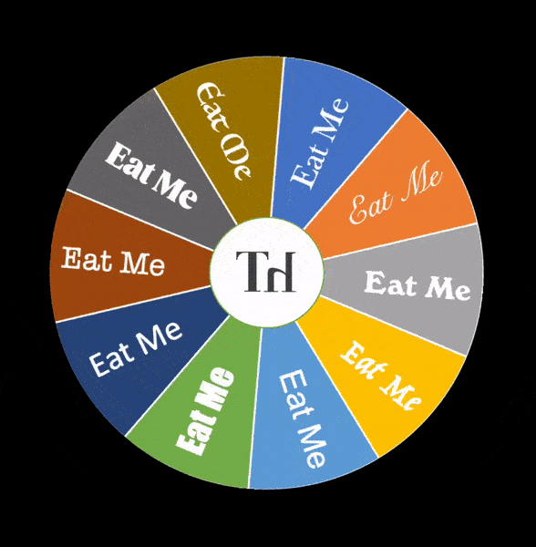
In two complimentary experiments, participants were given different pictures of the words ‘eat me’ written with fonts that ranged from more curvaceous to sloping shapes. Scholars asked them to arrange and combine each typeface to a taste word, and select those which they preferred and were easier to read.
The results demonstrated that people would single out rounded fonts as more readable. Processing fluency, as scholars described it, was received as an element that can positively alter the way fonts are perceived, for stimuli that are simpler to interpret might be experienced as more attractive.
“Legibility […] is proving to give some headway in terms of thinking about what are really the visual factors that affect the way we perceive, read and take in information,” said Professor Eric Kindel, Head of the Department of Typography and Graphic Communication at University of Reading, who however dismisses studies solely based on psychological dispositions. “[Readability] moves away from personality as such and more towards attributes of letterforms, typefaces, and contexts of reading.”
But the way fonts are then associated to food tastes is in fact due to an affective correspondence. As sweet is commonly favoured as a pleasant taste, researchers state, people might relate it to words written with types that are more readable and popular. In turn, as fonts tend to become pointy, a connection with salty or bitter tastes can be triggered.
“Your very instinctive response is to curves and angles. Angular pointy shapes look aversive; we like curves, we don’t like angles,” said Sarah Hyndman, graphic designer who co-authored the paper and founded Type Tasting, a studio to measure emotional and multisensory responses to typography. “If something is putting you on alert with angles or scary shadows, then when you’re eating, you’re also still on alert for anything that might be sour, which means it’s possibly unripe or poisonous.”
The findings might be specifically relevant to designers and marketers, as logos and claims on the packaging could potentially lead buyers to anticipate a particular taste in the food they purchase.
“Something that goes unnoticed by most is that typography actually affects the entire consumer experience,” said Professor Carlos José Salgado, Director of NeuroSmart Lab at University of La Sabana who conducted research on how our behaviour as customers is influenced by shapes and colours. Fonts “also interfere in how we perceive foods, as well as the familiarity of brands or the softness of the fabric in a garment.”
What remains dubious is whether a predilection simply based on a hedonistic reaction to fonts might obscure health concerns over sweet products. As decisions at the grocery store are often taken subconsciously, a fair solution could lie in the middle – with a guilty plea made before getting to the tills.
“If you look in your shopping basket and think, ‘Oh, I’ve chosen that maybe because the packaging told me this, this, and this, but I’m still going to enjoy it anyway’, you should leave it” there, Hyndman said. “If you have a little bit more awareness of the process that you went through, that’s a win.”
Just so that you know, Tablecloth’s words are nothing to worry about. Our fonts are neither too sweet nor too salty but are disposed towards a slightly luscious and sugary aroma. We are nutritionists’ faves.
*
This article is part of Laying the Table, the column that explores all the ingredients used in the making of Tablecloth magazine.